
Learn how to enhance the user experience on e-commerce websites for mobile users with effective design strategies and usability tips.
The Importance of Mobile Optimization

Mobile optimization is a critical aspect of designing e-commerce websites to cater to the growing number of users who shop on their mobile devices. In today’s digital era, more and more people are using smartphones and tablets to browse and make purchases online. As a result, ensuring that your e-commerce website is optimized for mobile users is essential to provide a seamless and user-friendly shopping experience.
One of the key reasons why mobile optimization is important for e-commerce websites is the ever-increasing trend of mobile usage. Studies have shown that a significant percentage of online shoppers prefer using their mobile devices for browsing products and making purchases. Therefore, failing to optimize your website for mobile users can lead to a negative impact on user experience and ultimately result in lower conversions and sales.
Moreover, Google and other search engines prioritize mobile-friendly websites in their search results. Websites that are not optimized for mobile are likely to rank lower in search engine results pages (SERPs), making it harder for potential customers to find your e-commerce site. By investing in mobile optimization, you not only improve the user experience but also enhance your website’s visibility and reach.
Additionally, a well-optimized mobile website can increase customer engagement and retention. Responsive design, fast loading times, and intuitive navigation are crucial factors that can significantly impact user satisfaction. By providing a seamless shopping experience on mobile devices, you can build customer loyalty and encourage repeat purchases.
In conclusion, mobile optimization is a vital aspect of designing e-commerce websites to meet the needs and preferences of mobile users. By prioritizing mobile responsiveness, speed, and user experience, you can attract more customers, improve search engine rankings, and ultimately drive higher conversions and sales.
Responsive Web Design Principles
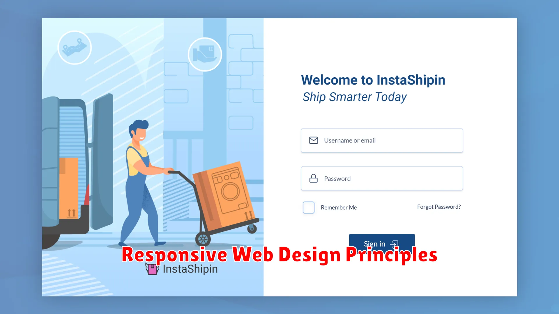
When optimizing e-commerce websites for mobile users, it is crucial to adhere to responsive web design principles to ensure a seamless browsing experience across all devices. Here are some key principles to consider:
- Flexible Grid Layout: Implement a grid system that can easily adapt to different screen sizes. This ensures that your website layout remains consistent and visually appealing on various devices.
- Media Queries: Use media queries to define specific styles for different screen sizes. By applying targeted styles based on device dimensions, you can optimize content display and improve readability.
- Viewport Meta Tag: Include the viewport meta tag in your HTML to control the viewport’s dimensions and scaling on mobile devices. This helps ensure that your website renders properly on smartphones and tablets.
- Fluid Images: Instead of fixed-width images, use fluid images that can scale according to the screen size. This approach prevents images from getting cut off or distorted on mobile screens.
- Mobile-Friendly Navigation: Simplify navigation for mobile users by implementing a user-friendly menu structure. Consider using collapsible menus, burger icons, or sticky navigation bars for easy access to key sections of your e-commerce site.
- Touch-Friendly Design: Optimize buttons, links, and interactive elements for touch screens. Ensure that buttons are large enough to be tapped easily and that there is enough spacing between clickable elements to prevent accidental taps.
- Performance Optimization: Prioritize performance optimization to enhance loading speed on mobile devices. Compress images, minify CSS and JavaScript files, and utilize caching techniques to improve website speed and user experience.
Simplifying Navigation for Mobile Users

When it comes to optimizing e-commerce websites for mobile users, one crucial aspect to focus on is simplifying navigation. Mobile users expect a seamless and intuitive experience while browsing an online store through their smartphones or tablets. Here are some design and usability tips to enhance navigation for mobile users:
1. Implement Clear and Concise Menus
Ensure that your menu is easily accessible and displays clearly on smaller screens. Use icons or labels that are easily understood and allow users to navigate through different sections of your site effortlessly.
2. Streamline Search Functionality
Include a prominent search bar that is easy to locate and use on mobile devices. Implement filters and sorting options to help users find products quickly without feeling overwhelmed by too many choices.
3. Utilize Breadcrumbs for Easy Backtracking
Integrate breadcrumbs into your mobile site’s design to assist users in navigating back to previous pages or categories. This feature enhances the user experience by providing a clear path and context within the site hierarchy.
4. Optimize Call-to-Action Buttons
Make sure that your call-to-action buttons, such as “Add to Cart” or “Checkout,” are prominently placed and easily clickable on mobile screens. Use contrasting colors to make these buttons stand out and encourage user interaction.
5. Test and Iterate for Improved Usability
Regularly conduct usability testing with real mobile users to gather feedback and insights on navigation issues. Use this data to make iterative improvements to your site’s mobile navigation, ensuring a smooth and user-friendly experience.
Enhancing Loading Speeds on Mobile Devices

When it comes to optimizing e-commerce websites for mobile users, one crucial factor to consider is enhancing loading speeds on mobile devices. In today’s fast-paced digital world, mobile users expect quick and seamless browsing experiences, especially when shopping online. Slow loading times can lead to user frustration and high bounce rates, ultimately impacting conversion rates and revenue.
Here are some design and usability tips to improve loading speeds on mobile devices:
1. Optimize Images and Media
Large image files and videos can significantly slow down a website’s loading speed on mobile devices. To reduce loading times, optimize images by compressing them without compromising quality. Consider using next-generation image formats like WebP to enhance loading speeds without sacrificing visual appeal. Additionally, use lazy loading techniques to prioritize loading critical content first.
2. Minimize HTTP Requests
Each HTTP request adds to the overall loading time of a website. Minimize the number of HTTP requests by combining CSS and JavaScript files, reducing the use of external resources, and leveraging browser caching. By streamlining the number of requests, you can help improve the loading speed of your e-commerce website on mobile devices.
3. Implement Responsive Design
Responsive design ensures that your e-commerce website adapts seamlessly to different screen sizes and devices, providing an optimal user experience. By implementing responsive design principles, you can eliminate the need for separate mobile versions of your website, reducing loading times and improving overall performance on mobile devices.
4. Prioritize Content Loading
Load essential content first to enhance user experience on mobile devices. By prioritizing the loading of critical elements such as product descriptions, prices, and call-to-action buttons, you can engage users from the moment they land on your website. Avoid delays in displaying crucial information to minimize bounce rates and increase conversions.
5. Monitor and Test Performance Regularly
Continuous monitoring and testing of your e-commerce website’s performance on mobile devices are essential to identify potential bottlenecks and areas for improvement. Utilize tools like Google PageSpeed Insights and GTmetrix to analyze loading speeds, optimize performance, and deliver a seamless mobile browsing experience to your users.
Mobile-Friendly Checkout Processes
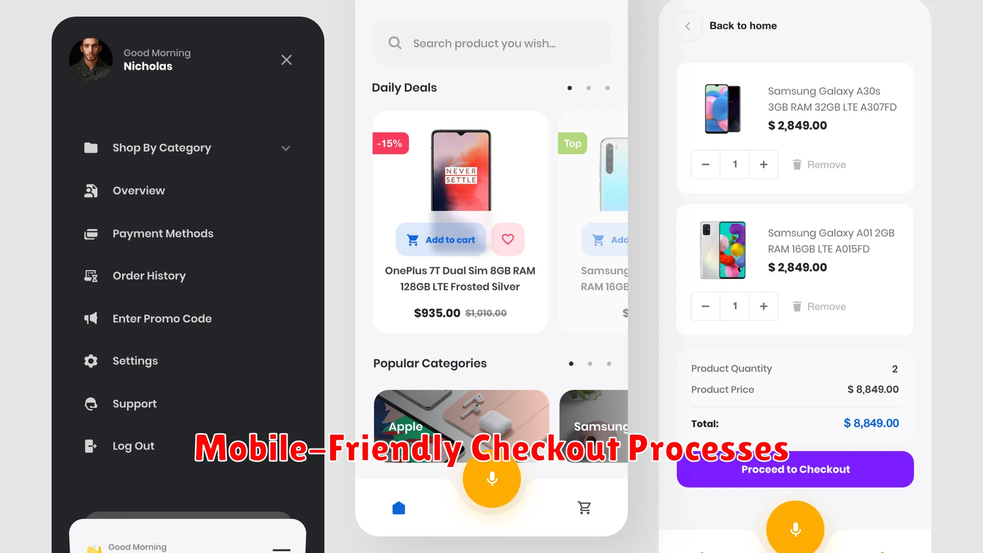
In today’s digital age, mobile shopping has become increasingly popular, with more users turning to their smartphones or tablets to make purchases on e-commerce websites. To ensure a seamless mobile shopping experience, optimizing checkout processes for mobile users is crucial for e-commerce businesses. Here are some tips to create mobile-friendly checkout processes:
Simplified Form Fields
Streamline the checkout form by minimizing the number of fields required. Mobile users may find it tedious to fill in lengthy forms on a small screen, leading to cart abandonment. Essential information such as name, shipping address, and payment details should be the main focus.
Clear Call-to-Action Buttons
Highlight CTA buttons such as “Buy Now” or “Place Order” prominently on the mobile screen. Make sure they are easily clickable and navigate users to the next step in the checkout process. Contrasting colors and larger fonts can help draw attention to these buttons.
Multiple Payment Options
Offer various payment methods to cater to different preferences of mobile shoppers. Popular options like credit card, digital wallets, and mobile payments should be included. Providing a secure and convenient payment experience enhances user trust.
Guest Checkout Feature
Simplify the checkout process by including a guest checkout option. Many mobile users appreciate the ability to make a purchase without creating an account, saving time and reducing friction in the checkout flow.
Testing and Improving Mobile User Experience

Optimizing e-commerce websites for mobile users involves continuous testing and improving the mobile user experience to ensure a seamless and effective shopping journey. Here are some key strategies to enhance mobile user experience:
1. Responsive Design Testing
One of the crucial steps in optimizing e-commerce websites for mobile users is to test the responsiveness of the design across various devices and screen sizes. Conduct thorough testing to ensure that the website layout adapts seamlessly to different screens and maintains usability.
2. Speed and Performance Testing
Mobile users expect fast-loading websites. Test the speed and performance of your e-commerce website on mobile devices to identify any bottlenecks or areas for improvement. Implement optimization techniques such as image compression and minification to enhance speed.
3. User Feedback and Testing
Collect user feedback through surveys, reviews, and usability testing to understand the needs and preferences of mobile users. Use this feedback to make informed decisions and improvements in the design and functionality of the e-commerce website.
4. Mobile-Friendly Navigation
Simplify the navigation menu for mobile users by using clear categories, search functionality, and easy access to essential pages such as product listings, cart, and checkout. Ensure a seamless navigation experience for users browsing on smaller screens.
5. Mobile Payment Optimization
Optimize the mobile payment process by streamlining the checkout flow, offering multiple payment options, and ensuring secure transactions. Test the payment gateway on different mobile devices to identify any usability issues and improve the overall transaction experience.
By implementing these strategies and regularly testing and improving the mobile user experience, e-commerce websites can enhance customer satisfaction, increase conversions, and drive mobile sales.
Case Studies: E-commerce Sites with Exceptional Mobile Design

In the realm of optimizing e-commerce websites for mobile users, mobile design plays a pivotal role in enhancing user experience and driving conversions. To shed light on successful practices, let’s delve into case studies of e-commerce platforms that have exemplified exceptional mobile design:
1. Amazon
Amazon is a prime example of an e-commerce giant that excels in mobile design. Its user-friendly interface adapts seamlessly to various devices, offering a consistent shopping experience. With intuitive navigation and a clean layout, users can easily browse products, add items to their carts, and complete transactions with minimal friction.
2. ASOS
ASOS, a popular online fashion retailer, stands out for its mobile-responsive design that prioritizes visual appeal and easy navigation. The site’s high-quality images and intuitive search functionality enhance the shopping experience, catering to the preferences of mobile users who seek efficiency and style.
3. Etsy
Etsy, known for its unique handmade products, provides a mobile interface that emphasizes personalization and engagement. Through tailored recommendations and seamless checkout processes, Etsy leverages mobile design to foster a sense of connection between users and independent sellers, promoting repeat visits and loyalty.
Conclusion: The Future of Mobile E-commerce

As mobile usage continues to dominate online shopping trends, it is imperative for e-commerce websites to optimize their platforms for mobile users. The future of mobile e-commerce is bright, with advancements in technology and consumer expectations driving the need for enhanced user experience.
Design and usability tips play a crucial role in ensuring that mobile e-commerce websites meet the evolving needs of customers. By incorporating responsive design, intuitive navigation, and seamless checkout processes, businesses can provide a seamless shopping experience for mobile users.
Personalization and customization are also key factors in shaping the future of mobile e-commerce. Tailoring product recommendations, offering loyalty rewards, and interactive features can create a more engaging shopping journey for users on mobile devices.
Moreover, as mobile payment technologies continue to evolve, ensuring a secure and convenient payment process is essential for driving conversions on mobile platforms. Implementing alternative payment methods and faster checkout options can streamline the purchasing process and increase customer satisfaction.
In conclusion, by prioritizing mobile-friendly design, enhancing usability, and embracing emerging technologies, e-commerce websites can position themselves for success in the ever-growing mobile e-commerce landscape. The future holds great potential for businesses that adapt to the changing needs and expectations of mobile shoppers.
Conclusion
In conclusion, optimizing e-commerce websites for mobile users is crucial for a seamless shopping experience. Implementing responsive design and user-friendly interfaces are key factors in driving conversions and customer satisfaction.